
Sunday, 2 December 2007
Friday, 23 November 2007
Wednesday, 21 November 2007
Thursday, 8 November 2007


Wednesday, 7 November 2007
stuff

This is from a great website called Graphic Exchange with loads of indentity inspiration and eye candy
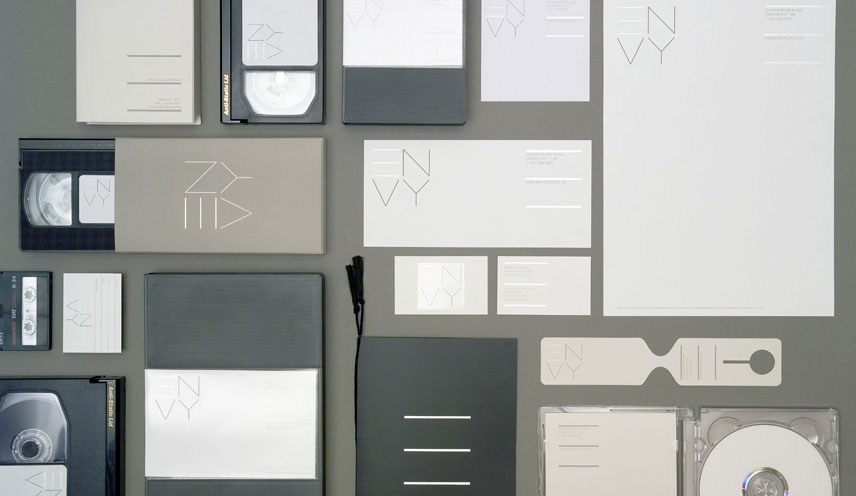
ENVY by Why not associates

To me this would have been so satisfying to do!!

Clever little idea and cute.
Both via The Serif
Saturday, 22 September 2007
Thursday, 20 September 2007
Simplicity
Great TED lecture from John Maeda fro the MIT media lab. He is talking about his book "the laws of simplicity" which I have but never had chance to read. He is one very cool cookie.
Friday, 14 September 2007
Thursday, 6 September 2007
Pulp Fiction motion type
This has been around for ages but definatly worth a look. Reminds me of Alex Gophers the child a little bit.
Friday, 24 August 2007

Thom yorke video also
This one is very clever and can remember being very impressed when I saw it at new blood.
Thom yorke video
I really liked this video that was done for D&AD by Kingston Students. Glad it won a pencil.
Wednesday, 22 August 2007

Mugs

Just saw these on {black.white.bliss} and think they are pretty cool. I am still lovin my pantone mugs though ...
Stranger than fiction
I have always loved the style of the title sequence to stranger than fiction. Awesome
Tuesday, 14 August 2007
Women "rock-star" designers

This article Wy are there so few female "rock star" graphic designers?
Another great piece of writing by Michael Bierut. Milton Glaser's reply to the question, while probably true is very blunt.
[Glaser said] that the reason there are so few female rock star graphic designers is that “women get pregnant, have children, go home and take care of their children. And those essential years that men are building their careers and becoming visible are basically denied to women who choose to be at home.” He continued: "Unless something very dramatic happens to the nature of the human experience then it’s never going to change." About day care and nannies, he said, "None of them are good solutions."

Processing

After hearing about processing I saw this piece of infoGraphics by Sagmeister down with processing and was thoroughly impressed.
Sunday, 5 August 2007
tanyaholbrook.com
My website is finally up and running. Still a lot to do and fix, but its a work in progress. Some of the work needs to be retouched and laid out in a more sympathetic way. I would like to have all the print work photographed and then put up, but that will take time. I want to link to my blog as well, hence to quick redesign of my blog.
Hope you enjoy.
Hope you enjoy.
Thursday, 2 August 2007

Friday, 20 July 2007

Saturday, 23 June 2007

Alan Fletcher: Living by design
This is a great article written by Michael Bierut from Pantagram NY.
here
"I'd sooner do the same on Monday or Wednesday as I do on a Saturday or Sunday. I don't divide my life between labour and pleasure." Alan Fletcher
here
"I'd sooner do the same on Monday or Wednesday as I do on a Saturday or Sunday. I don't divide my life between labour and pleasure." Alan Fletcher
no. 10
In his book Picturing & Poeting Alan Fletcher says, "The 0 in the number 10 on the black door of the British prime minister's house at 10 Downing Street is wonky. Take a look when you next see a newsreel."

He's correct. And I know why.
It's supposed to be so that when you look down the street (from Whitehall) you see the door at an angle and the 0 looks straight.


He's correct. And I know why.
It's supposed to be so that when you look down the street (from Whitehall) you see the door at an angle and the 0 looks straight.


War & Error

War & Error Letterpressed stickers printed at the London College of Printing.
Shemagh scarves; fashion or protest.
Friday, 22 June 2007
Type trumps


A set of Type Trumps, a play on the game Top Trumps, in which different typefaces are attributed numerical values. These figures are then used to enable the cards to be won or lost using some of the tried & tested ‘Top Trumps’ rules. The Type Trumps have a ‘ranking’, which is a subjectively ascribed positional value based on my personal favourites. Each card also has a ‘special power’ in which participants have to debate which would win. Both the ranking system & the strings of ‘special powers’ add a whole new geeky dimension to the game!


Wedding invitation

Simply removing the dot from the word ‘claire’ reveals the word ‘dave’ proving that they really were meant to be together. The word ‘dave’ was printed in metallic blue on uncoated white stock and covered by a translucent stock which carried the dot of the ‘i’ and the wedding details on the reverse. The two sheets were then stitched together with white cotton.
Entered into D&AD 2007 Annual. Won Gold in the New York Festivals.
www.chrismaclean.co.uk
Johanna Lundberg


www.johannalundberg.com
During last autumn she did a 3 months internship at GH avisualagency (www.ghava.com)
in NYC. Between January and March she was at Syrup Helsinki (www.syruphelsinki.com) in
Finland, and spring was spent in Berlin at Neue Gestaltung (www.neuegestaltung.de). ---------- bloody hell, I feel lazy ...
Saturday, 16 June 2007


Thursday, 7 June 2007


Pink Prank

A friend went on holiday. 5 friends got hold of his keys and turned his messy flat into an art installation. Madness.
website


Wednesday, 30 May 2007
Atlas
20 page hand stitched atlas that blurs the boundries between the countries. Done by a student at LCC


Jamie Wieck

Decisions, decisions


Virgin Atlantic were launching a beverage service for their long haul flights and needed a series of logos that were capable of doubling as pattern for their beverage packs.
Keen-eyed passengers may spot that each stain contains a discreet skyline of a popular Virgin destination.

resented to Virgin Atlantic, these cups where designed to work with the progressive movement of an airline beverage trolley.
On entering each cabin section the cup's 'Tea?' or 'Coffee?' choices are clearly visible to those waiting further down the aisle, yet as the trolley approaches the waiting passengers the cup's choices 'fade' to an understated pattern.
Thursday, 10 May 2007
Tobias Wong
Brilliant artist/designer/sculpture who does the most amazing readymades and generally cool/contraversial stuff.

Lucifer

Turn lucifer over and a match will pop out. As you pull it out it will light. Magic

Lucifer

Turn lucifer over and a match will pop out. As you pull it out it will light. Magic
Subscribe to:
Comments (Atom)